How People Read and Why It Matters for Marketers
It’s human nature to skim while reading, even if it is something that you will later go back and read entirely. You may have even briefly skimmed this blog post before reading because the bold, lengthy title, followed by shorter subheadings and brief buzzwords, serves you the information you need from the post.
The “F” Pattern
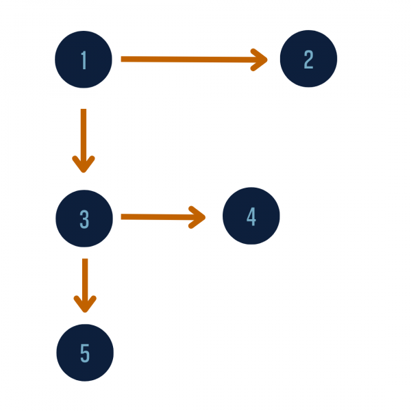
The “F” pattern describes how our eyes scan content blocks. When we read, our eyes start at the top left corner, across the first line, then progressively read less and less of the following lines until we find something of interest or what we were initially looking for.
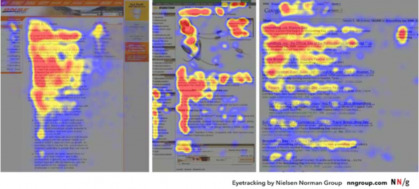
We move our eyes 2-3 times a second, even when focusing on one particular thing. Studies have shown that most people have the same reading patterns. Back in 2006, the NN Group’s eye-tracking study recorded 200+ readers’ habits when reading over thousands of web pages- and their findings became the blueprint for creating compelling content since then. What did most have in common? They read Fast, and in the shape of an F. Information from this study drastically changed the way content creators, marketers, website builders, and others delivering information organized their pieces.

“Heatmaps from user eye-tracking studies of three websites. The areas where users looked the most are colored red; the yellow areas indicate fewer views, followed by the least-viewed blue areas. Gray areas didn’t attract any fixations.”

What that means to you as a marketer:
People don’t read; they scan. Keeping this F shape pattern in mind as a guideline when creating content (social media posts, advertisements, blogs, web design, product design, etc.) will ensure that the message you want to deliver is construed efficiently.
Tips:
- Use headings and subheadings when sharing a large amount of information
- This will guide your viewer to see exactly where the information they are looking for is located.
- Prioritize your content
- Before designing your layout, sort your content from most to least important. This will make implementing key messages into the correct areas much easier.
- Cut unnecessary parts
- Do not crowd your space with filler information. Keep it short and sweet!
- Design for scanners
- Make sure your CTAs are bold and placed on the left side of the page.
- Highlight key words throughout your text.
- Use bullet points.
Avoid wasting time creating lengthy content that is hard for readers to digest. By following the Fast and F-shape rule, your target content will produce its desired result.


